Interactive dataframes
marimo makes you more productive when working with dataframes.
- Display dataframes in a rich, interactive table and chart views
- Transform dataframes with filters, groupbys, aggregations, and more, no code required
- Select data from tables or charts and get selections back in Python as dataframes
marimo integrates with Pandas and Polars dataframes natively.
For a video overview on interactive dataframes, check out our YouTube tutorial.
Displaying dataframes
marimo lets you page through, search, sort, and filter dataframes, making it extremely easy to get a feel for your data.
Display dataframes by including them in the last expression of the cell, just like any other object.
To opt out of the rich dataframe viewer, use mo.plain:
Transforming dataframes
No-code transformations
Use mo.ui.dataframe to interactively
transform a dataframe with a GUI, no coding required. When you're done, you
can copy the code that the GUI generated for you and paste it into your
notebook.
The transformations you apply will turn into code which is accessible via the "code" tab.
Formatting values
Use format_mapping to format values for display in the dataframe UI. This
affects how values appear in the table but does not change the underlying
data returned by .value or downloads.
import marimo as mo
import pandas as pd

df = pd.DataFrame(
    {"person": ["Alice", "Bob"], "age": [20, 30], "height_cm": [165.2, 180.4]}
)

def format_height(value: float) -> str:
    return f"{value:.1f} cm"

mo.ui.dataframe(
    df,
    format_mapping={
        "age": "{:d} years".format,
        "height_cm": format_height,
    },
)
Custom filters
Create custom filters with marimo UI elements, like sliders and dropdowns.
# Cell 1 - create a dataframe
df = pd.DataFrame({"person": ["Alice", "Bob", "Charlie"], "age": [20, 30, 40]})
# Cell 1
import marimo as mo
import polars as pl

df = pl.DataFrame({
    "name": ["Alice", "Bob", "Charlie", "David"],
    "age": [25, 30, 35, 40],
    "city": ["New York", "London", "Paris", "Tokyo"]
})

age_filter = mo.ui.slider.from_series(df["age"], label="Max age")
city_filter = mo.ui.dropdown.from_series(df["city"], label="City")

mo.hstack([age_filter, city_filter])
Select dataframe rows
Display dataframes as interactive, selectable charts using
mo.ui.altair_chart or
mo.ui.plotly, or as a row-selectable table with
mo.ui.table. Select points in the chart, or select a table
row, and your selection is automatically sent to Python as a subset of the original
dataframe.
Dataframe panels
Dataframe outputs in marimo come with several panels to help you visualize, explore, and page through your data interactively. These panels are accessible via toggles at the bottom-left of a dataframe output. If you need further control, after opening a panel you can
- pin the panel to the side of your editor for persistent access;
- toggle focus to automatically display the currently focused dataframe in the panel.
Note
Toggles are visible when editing notebooks (with marimo edit ...) but not when running notebooks as apps (with marimo run ...), except for the row viewer which is available in both.
Row viewer panel
To inspect individual rows, open the row viewer. This presents a vertical view of the selected row.
- Press
Spaceto select/deselect the current row - Use arrow keys (
←→) to navigate between rows - Click on any row in the dataframe to view its data in the panel
Column explorer panel
To explore your data, open the column explorer where you can find summary statistics and charts for each column. Click the + button to add the chart code to a new cell.
This requires the altair package to be installed. For large dataframes, vegafusion is also needed to render charts. To use the generated Python code, enable vegafusion in your notebook:
Chart builder
The chart builder toggle lets you rapidly develop charts using a GUI, while also generating Python code to insert in your notebook. Refer to the chart builder guide for more details.
Preferences
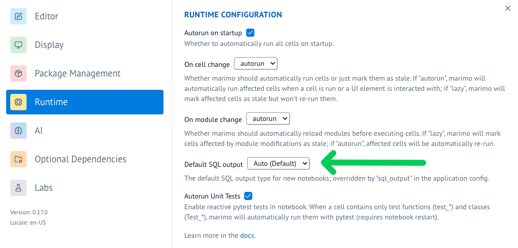
When you run a SQL cell in marimo, you can get the output returned as a dataframe. If you have a preference for a specific dataframe library as a default you can configure the "default SQL output" in the user settings by going to the "Runtime" tab.
Alternatively you can also use the marimo configuration file to configure the default SQL output.
Example notebook
For a comprehensive example of using Polars with marimo, check out our Polars example notebook.
Run it with: